

5 Random Highlights Of Mutual Fund, ETF Websites
/ TweetCan we agree that mutual fund and ETF Websites have more similarities than differences? For that, give the credit or blame to American Funds, the mutual fund company whose products are distributed by the highest percentage of financial advisors. If an advisor has already mastered American Funds’ site, so the reasoning goes, who are we to buck the tide and risk the advisor shunning our site because it dares to be different?
It’s a user-friendly call that we suspect has nonetheless had the effect of suppressing creativity or even brand differentiation. That's why when a Web site offers something special, the discovery is an unexpected pleasure. Here’s a random list of what we’ve tripped across in my recent travels on asset management sites. Well done!
A question to the managers of these sites: Are you leveraging them as the link bait you should in order to draw visitors to your site, first to that page and maybe to explore the rest of your value proposition?
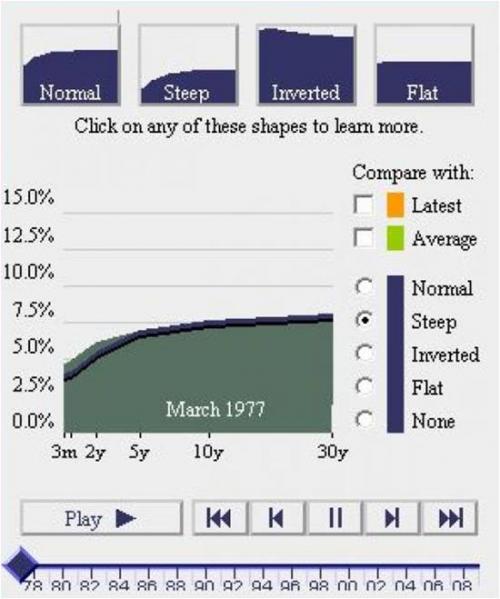
1. Fidelity Investments’ Historical Yield Curve
Of all the gorgeous, exciting visualizations of data to be found on the Web today, this isn’t one of them. But it’s a true gem, very, very cool. A site visitor could spend minutes on this page learning. Marketing managers, when it’s time to hire again and you have a green marketing communications staffer, park them in front this.
2. Legg Mason’s Timeline
For a showier production (although less interactive), Legg Mason’s Learning the Lessons of Time timeline provides some perspective on the markets over time (“The Dates May Change But the Headlines Stay the Same”), as illustrated with Time magazine covers. There’s also an accompanying brochure available in .pdf form.

3. Janus Funds' Interactive Newsletter
Anybody and everybody can post the Adobe Acrobat file of an investor newsletter that was originally produced for print distribution. This newsletter takes advantage of the medium it’s delivered on—and notice the Web exclusives.

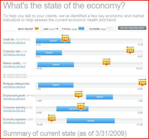
4. Russell Investments' The Economic Recovery Dashboard
Throughout the financial markets crisis, Russell Investments has been acknowledged by the media and financial advisors for the depth of its communications. The dashboard is the interactive part of its Helping Advisors microsite. This was launched at a time when others were just getting their analyses of the financial crisis out the door, making Russell’s focus on recovery look even more timely. We bet the producers wish, as we do, that its data refresh could be more frequent.
5. Barclays' iShares Exploring ETFs Video
In case we miss an opportunity to say so after Barclays sells its iShares unit, can we just say now how much we have admired Barclay iShares? From our vantage point, Barclay’s innovative marketing support of ETFs has played a significant part in the next-generation investment product vibe that ETFs have today. Check out this interactive and entertaining video. It will keep you waiting because it doesn’t load quickly but bravo on the look and the messaging. Also note that the heavily branded yet ETF educational video can be downloaded.


