Content Marketing Begins At Home
/ TweetRobust content production, pay-per-click (PPC) ads, social media participation. All of these reflect a commitment to content marketing.
And, lately, I’ve been seeing another sign of investment brands thinking like publishers: The appearance of “ads” on Website pages designed to drive traffic to other pages on the site.
I put quotation marks around “ads” because there’s no payment involved when it’s your own site, just the creation and placement of a graphic. (Unless some of you are managing to charge business units as a means of developing a digital marketing revenue source, to which I would tip my Chicago Blackhawks cap to you. Nice work if you can get it.)
For purposes of this post, an ad is a counter-message to what appears on the page. It’s not Related content or a Learn More element. Its purpose is to lead site visitors elsewhere. Let’s take a look at a few examples.
Give That Twitter Account Some Support!
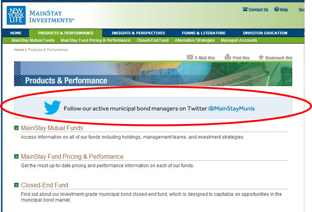
Look at how MainStay Investments calls attention to the firm’s relatively new (and second) Twitter account @MainStayMunis. A Twitter account promo appears in the right-hand column of many pages. But so there’s no chance of anyone overlooking it, the Products & Performance listing in the center of the page has been shoved down to accommodate the ad.
Oppenheimer Offers Options
It stands to reason that if someone is reading one commentary, he or she might very well be interested in other commentary. Below is a screenshot of a partial page of the Oppenheimer Weekly Market Review. Note the dueling promo on the left-hand side linking to a video on emerging markets.
T. Rowe Price Follows The Eyeballs
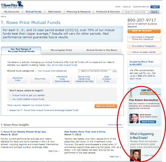
The most trafficked pages make the most sense for promotions. Example: This week T. Rowe Price’s Mutual Funds landing page was the home to not one but two graphics created to drive interest in fresh content.
John Hancock Doubles Up
Usually, product profile pages are sacrosanct. There’s more than enough to say about the product in question, let alone mention any other product. But in this example I’ve been saving for a while, check out how one John Hancock fund seeks to leverage attention paid to another fund.
This is a screenshot of an iPad ad landing page. While John Hancock paid to advertise the John Hancock Alternative Asset Allocation Fund, the intent of the leaderboard size ad at the bottom of the landing page was to drive traffic to another fund profile. Toward the end of last year I could have sworn I saw the same Big Box Opportunities ad on random (to me, not to John Hancock) fund profile pages on the site. Unfortunately, I can’t find it on the site to show you today.
Worth A Try?
One message per page. That's a direction from back in the day when we all believed that people would arrive at a Website's home page and leisurely browse the rest of the pages on the site. Oh the naiveté. Today we know 1)that interior pages can get 10 times the traffic of the home page and 2)the most effective way to get attention for something new online is to barge in on something that already has an established audience.
The "violating" of tidy, single-purpose pages may require some explaining to business stakeholders. But experimentation with with a few spot ads shouldn't meet up with many technological hurdles, although some content management systems will support better than others. One way or the other, you should be able to add a counterprogramming graphic to a few well viewed pages. Be sure to include tracking code and then watch your analytics to see if you've successfully boosted the visibility of the new content. Worth a try?


