The Best Of The First Half: 5 Awesome Marketing Infographics
/ TweetHere’s the Marketing Executives Networking Group (MENG) Blend post I foreshadowed/warned you about in July. The post originally appeared on the MENG Blend, a blogging initiative featuring bloggers from multiple marketing disciplines and industries. I blog for MENG on online marketing and social media.
Sometimes, the concept of strangers taking time during their workdays to “share” content with other strangers can seem a bit forced, especially if it’s as part of a deliberate program to get out there and be social.
In my case, the sharing instinct is genetic—I come from a long line of article-clippers whose get-togethers tend to start with an exchange of newspaper articles, cartoons and coupons. My enthusiasm for the state-of-the art today is that the social sites enable sharing with like-minded professionals, most of whom I don’t know. While it’s not uncommon for deeper connections to build, that’s not what’s behind my urge to share.
Online reading today for me has become a three-part act involving 1)the discovering of “awesome” content 2)the pointing of others to it and 3)the learning about cool stuff from others.
When the following five marketing-relevant infographics appeared in the first half of the year, I tweeted about them, I liked them on Facebook and I bookmarked them. I emailed links to them to clients and other contacts. A few appear in presentations I’ve revised to make room for them.
What more can I do to show my love and appreciation for this work? Fortunately, I can share them with you. These five offer both information and presentation value. For close review, just click on the image to enlarge.
1. Planning Purpose-ful Content
When it first appeared in June 2010, Eloqua’s Content Grid provided a visual guide to the connection between content type and distribution channel. But version 2, created by JESS3 and published in June 2011, now anticipates the motivation of a “buyer” (or information-seeker) and the types of content that might be sought in a multi-state purchase funnel.
This is very helpful for content marketers—Eloqua says the grid is a “how-to for marketers looking tooperationalize content marketing programs.” And, it’s a deliverable perfectly aligned with what Eloqua sells (a marketing automation platform).

2. Visualizing The Issues
Here’s a way to get people to spend more time with your content than just writing word after word after word.
Graphics produced for the Microsoft/Rapleaf 2011 1st Annual Personalization Summit in May are visualizations more than infographics. If you’re a marketer who cares about the many layers driving the personalization debate or if you’re an event marketer just looking for an innovative way to structure session discussions and what’s reported out of them, you have to check these out. Shown is the chart illustrating Start-up Thinking: Personalization And Innovation.

3. What Happens After The Click
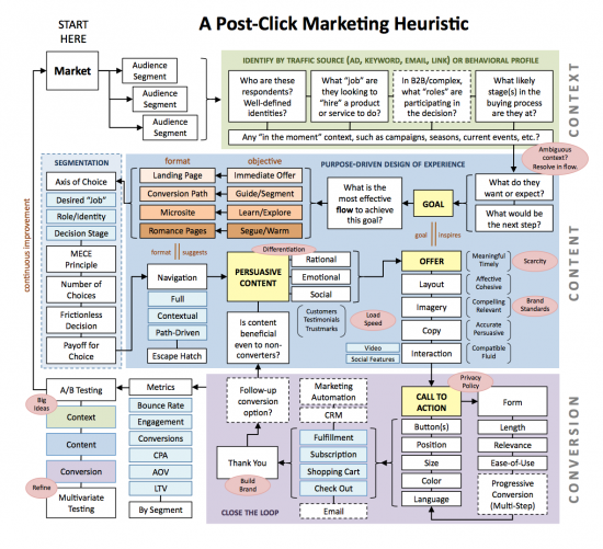
I’m already on the record on MENG Blend as being a follower of Scott Brinker’s work. (See What Do Marketers Think About A Chief Marketing Technologist?) In this diagram published with Brinker’s guest post on Search Engine Land in January, Brinker simplifies—yes, simplifies—all of the thinking that should underlie the creation, optimization and evaluation of what happens after the click on an online ad, email link, socially shared link, etc.
Marketing executives may not get into the nitty-gritty of all this but wouldn’t you like to know that it’s taking place?

4. First Things First—Match Objectives To Social Sites
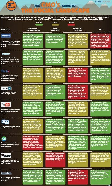
I liked the first The CMO’s Guide to the Social Landscape when it appeared in February 2010 but the second version, updated and revised in March 2011, is even better.
“Social media” is an umbrella term that encompasses very different social experiences. This one-pager syncs objectives with sites, at a high level. Shown here is just an image—you can download the full .pdf.
August note: This group's work is never done—surely, a new version is in the works reflecting Google+, launched in late June.

5. SEO: It’s Not A Science But That Doesn’t Deter The Scientific Thinking
“Search engine optimization—SEO—seems like alchemy to the uninitiated,” acknowledged Search Engine Land as it last month introduced this Periodic Table of SEO Ranking Factors. How content ranks in search engines and why is something that even the experts make just educated guesses at. The Periodic Table is a very smart visual explanation of the relative importance of individual ranking factors to search engines. Awe-some.

Now it’s your turn—what socko marketing infographics would you like to share? Let us know below.


